
Work · Case study · Brand identity
Red Roman Financial Services: a mark built on instinct
RedRoman takes its name from the Red Roman spider, a solifugid found across parts of Africa and known for its speed, precision and resilience under pressure. The client wanted a modern finance business, not a legacy institution: no crests, no serif gravitas, no borrowed heritage.
- Client
- Red Roman Financial Services
- Delivered
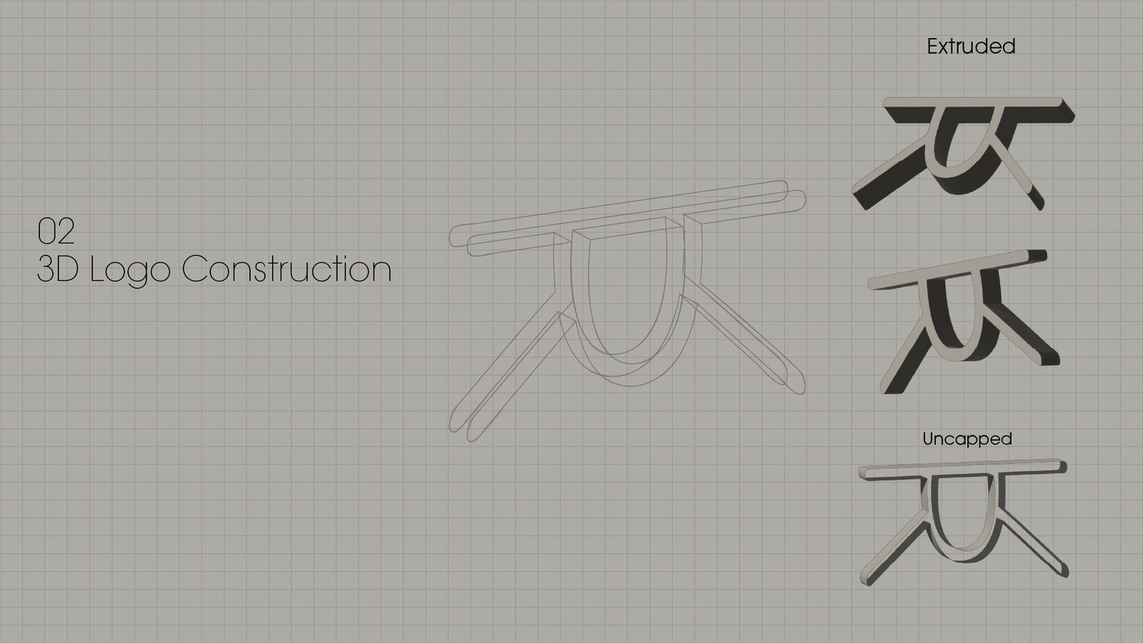
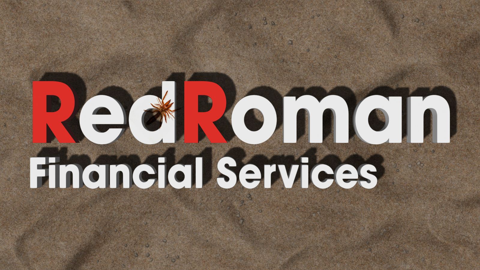
- Logo, brand book, 3D title, logo animation
- Typeface
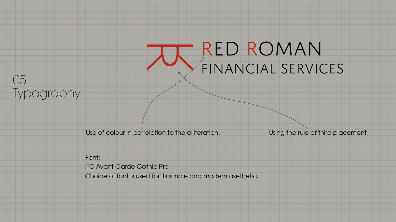
- ITC Avant Garde Gothic Pro
- Tools
- Illustrator, Photoshop, Maya, V-Ray
The idea
From spider to symbol
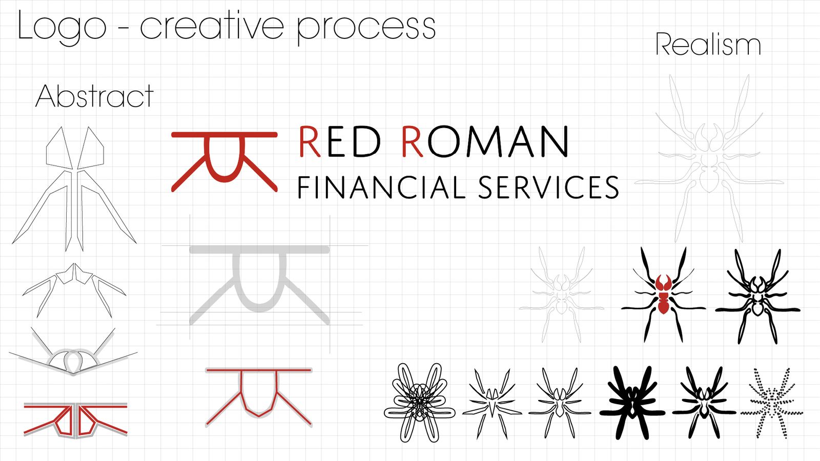
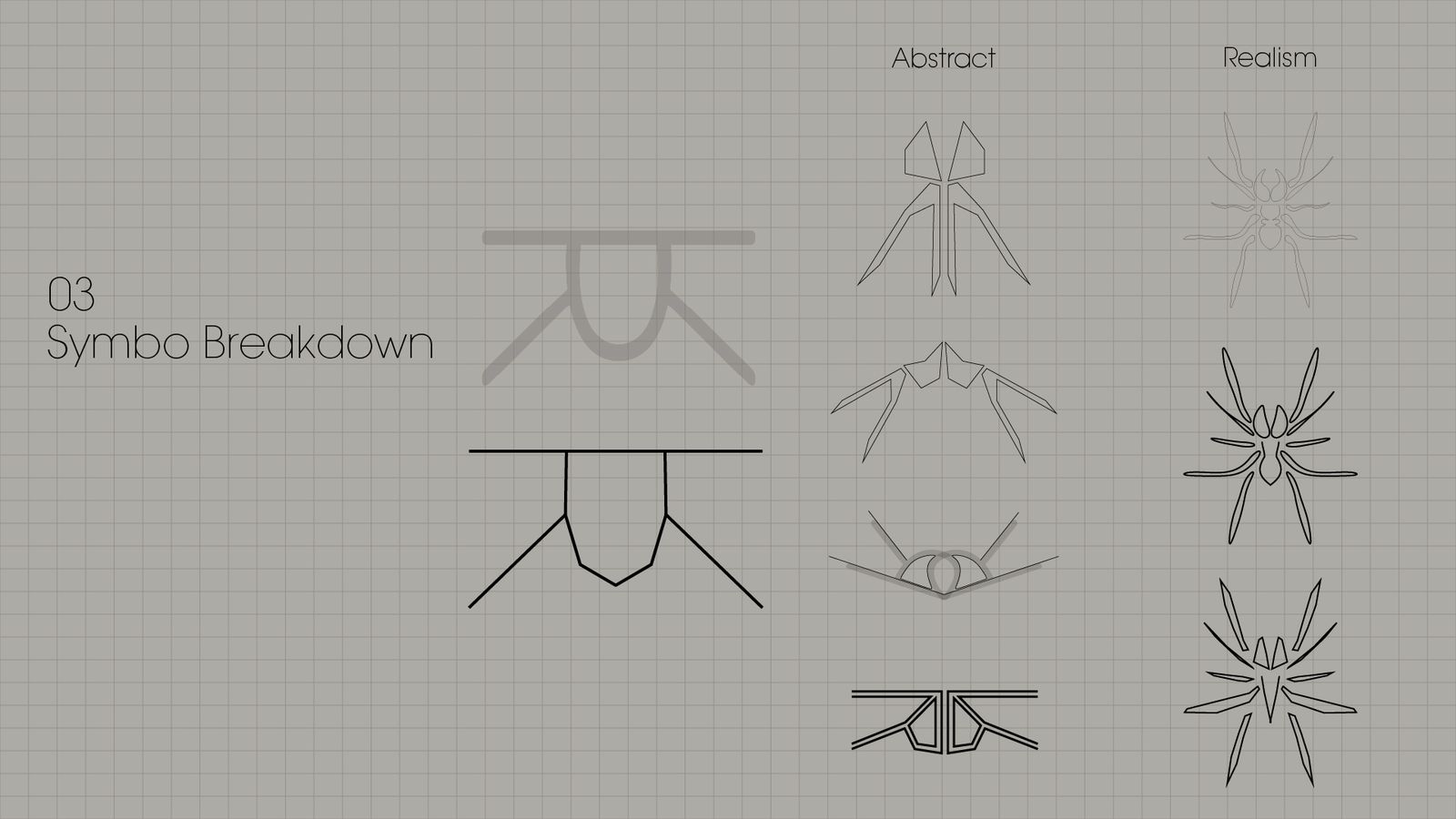
The spider is used as an abstracted symbol of agility rather than illustrated literally. Its essential geometry is distilled into a clean, architectural form, taking cues from its stance, the reach of its legs and its compact core.
The mark reads first as a symbol of strength and motion. Its namesake only becomes apparent on closer inspection. The aim was a result that feels less like an institution and more like a signal: sharp, current and forward-facing.
Creative process
Colour and type
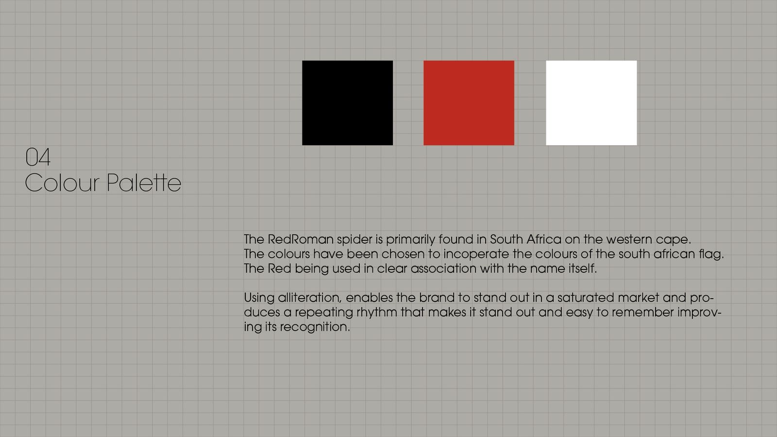
Black, red and white, with both Rs in red
The spider is found mainly in South Africa's Western Cape, so the palette draws on the South African flag, with red tied directly to the name. The alliteration is picked out in colour, and ITC Avant Garde Gothic Pro keeps the wordmark simple and modern.
In use

Need visuals that carry your brand?
Send me your brief, logo or product files and I'll come back with what's possible, a fixed price and a free sample render.
Get my free render